JOYWELL
PROJECT ROLE
CREATIVE DIRECTION

DEVELOPING A BOUTIQUE HOTEL THAT CONNECTS BUSINESS EXPERIENCE WITH REAL-LIFE MOMENTS
NAMING
BRAND STRATEGY
BRAND IDENTITY
BRAND EXPERIENCE
challenge
When entrepreneur Thuy Vi Vu had a dream of opening a collection of boutique hotels geared toward the millennial business traveler—a population that wasn’t being prioritized in the hospitality world. She knew it needed to be an experience unlike any other hotel, designed around an innate understanding of its customer base and thoughtfully curated to help them find joy in the business travel experience. Everything about the brand, from its name to the website to the physical property itself, needed to be built from the ground up.
approach
We built the brand positioning around the belief that joy makes life better, whether it’s expected or serendipitously through unintentional moments. We would give our guests the compassion and individualized attention they deserve throughout every step of their journey, taking care of not just their functional needs but the emotional ones as well. For a brand built around delivering a more emotional experience than its competitors, the name needed to be distinct, communicate the emotional benefit, and immediately convey a sense of belonging. The brand promise to customers is to stay well, live well, and ultimately Joywell.
BRINGING
JOY AND
POSSIBILITY TO
THE FOREFRONT
As with the other brand elements, the journey to create a logo for Joywell was rooted in bringing the emotion and spirit of the brand to life in an expressive way. The icon uses the letters “J” and “W” to form a visual of the sun rising at the horizon, symbolizing new opportunities and seizing the day. It’s grounded yet aspirational, honest yet hopeful. The wordmark is crafted from custom letterforms that appear notched or grooved at the stems, which feel personal and warm, just like Joywell. The logo represents the vision to bring more joy to the world and the commitment to shining light, elevating the guests’ journey, and guiding them toward new experiences and possibilities.


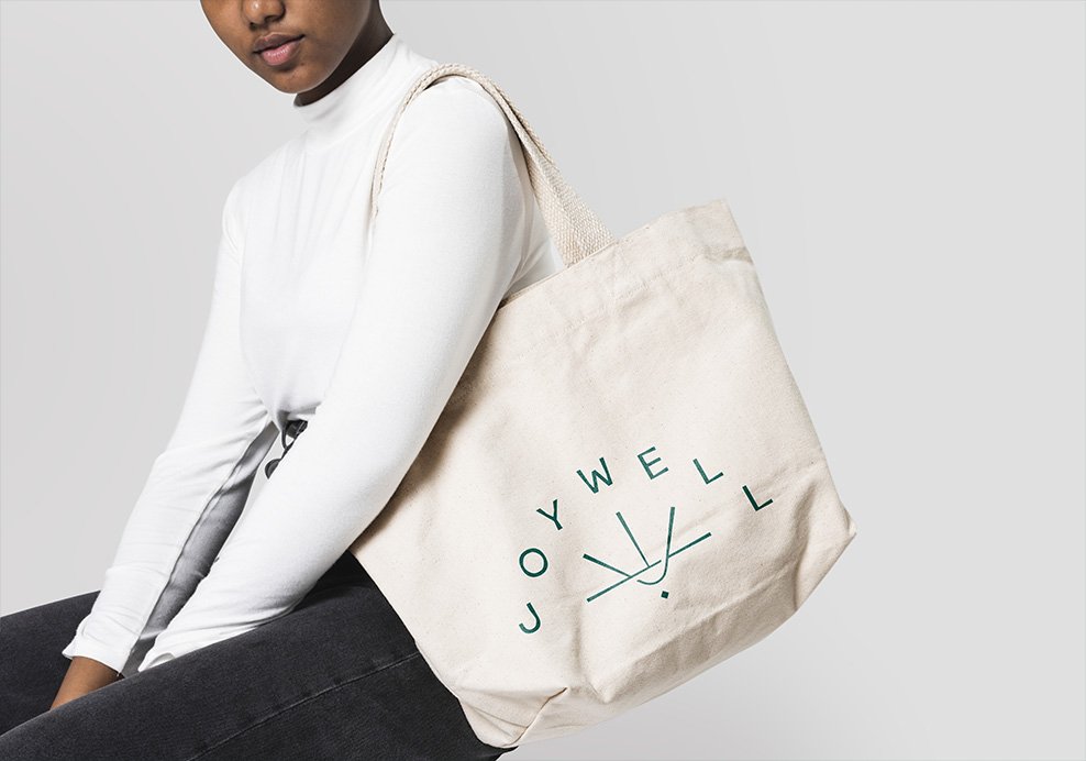
BUILDING A
BRAND IDENTITY
SYSTEM THAT BALANCES
OPTIMISM,
CURIOSITY, AND
QUIRKINESS
As the guide for all visual expressions of the brand from social to website to on-premise, the art direction needed to feel distinct and memorable, and uniquely Joywell. The color palette we selected was handpicked to inspire optimism, hope, and joy. We paired bright colors alongside earthier tones to maintain a grounded, down-to-earth look and feel. When it came to typography, we selected two typefaces: Gopher and Sophia Pro. Gopher is a reverse contrast sans serif typeface that delivers a hint of quirkiness and curiosity, while Sofia is a beautifully crafted geometric sans serif typeface that feels soft-spoken, straightforward, and reliable.


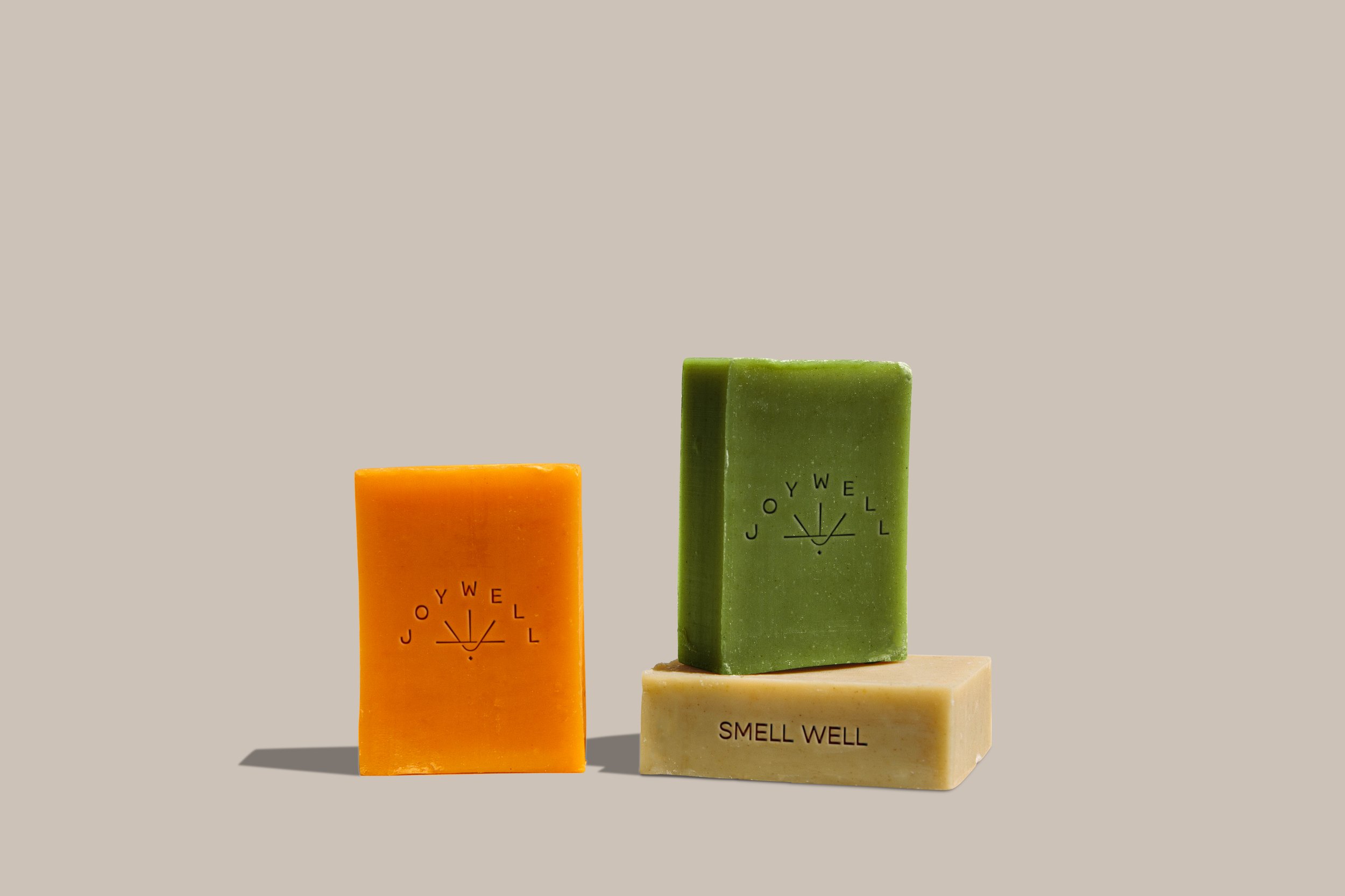
CREATING A CUSTOM SCENT THAT WELCOMES, INSPIRES, AND GROUNDS THE SOUL
With the emotional traveler in mind, we needed to go beyond just visual aesthetics to create a memorable experience. Sight. Sound. Touch… Smell. We created a custom Joywell scent that would be used through the hotel experience. Everything from candles, incense, soaps, shampoos, and essential oils were created with a unique scent paired down from countless testing and collaborations. In the end, the signature Joywell scent is one that is not forgotten.